
If you are one of the regular users of HootBoard, you might have noticed some branding changes recently. It was about time! HootBoard started as a digital bulletin board for organizations and has since evolved to become an in-real-life (#irl) information distribution platform focusing on easy to deploy information kiosks. HootBoard based kiosks have come to be known as being sleek, smart, easy-to-deploy, and versatile. Throughout this journey, our core values and philosophy have driven the development of the amazing platform HootBoard is today. And we wanted a brand identity that reflects just that. Below are some of the brand values that our new logo conveys.
The Brand Values:
IRL Screens First:
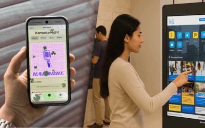
While HootBoard can be used on web or mobile, most users will first know of HootBoard via. a sleek HootBoard powered touch screen kiosk. Organizations have tons of options to engage their audiences online. However, they lose their audiences while they are in their own physical spaces. Traditional digital signage only works to a certain extent given that most content can’t easily be engaged with or pulled up for later review.
That is where kiosks shine. They can go beyond simple information sharing and encourage people to act. HootBoard has a strong belief in technology’s role to bridge the physical and digital worlds. IRL technologies are inherently democratic given that the user does not need their own device to access services. This makes kiosks a great equalizer in terms of citizen information and engagement.
With our new logo, we wanted to give a sense of space and the ability for our technology to make a difference IRL.
Simplicity:
To achieve our mission to democratize information access, one of the key qualities of HootBoard has to be simplicity. Simplicity not only for users to access this information but simplicity for administrators, posters, and in the future, advertisers of content on HootBoard. Simplicity has always been our team’s core motto and a building block for the HootBoard platform.
Simplicity is reflected at multiple levels within the HootBoard product. Whether it’s the simplicity of creating content, adding apps, integrations, setting up kiosks – you will see this core value pervasive in our implementation. It is only fair that we highlight this core trait as part of our brand.
If you compare the old HootBoard logo to the new one, simplicity is obvious. The clear uniform font, the way to depict kiosks, it all exudes this core trait.
Design Emphasis:
HootBoards are known for their design. Whether it is the vibrant colors, chic looking app icons, beautiful hoots (hootboard-ish for posts) design is pervasive. Our key philosophy always has been that any non-design savvy administrator (just like me) shall still be able to create a great looking HootBoard. As an administrator, they represent their own organization’s values. If they were to build a kiosk that will be front and center in their spaces, it has to look great right from the get-go.
The straight lines, clarity of purpose, and the simplicity in the new logo, all make up a modern design. This is exactly the design value we bring to our customer’s physical spaces and we wanted our brand to reflect that.
Versatility:
HootBoard kiosks are versatile. Whether it is adding and organizing content using collections, or adding apps for a variety of purposes, or creating unique kiosks per location even as part of the same account, versatility is an important building block for HootBoard. Given that HootBoard is a platform with the ability to add apps, and content; HootBoard kiosks can also be used for a variety of applications. Some of the key applications are outlined below, however, that is just a few.
Destination Marketing & Management | Education | Employee Information and Safety | Travel & Hospitality
Smart:
And last but not the least, HootBoard kiosks are smart. The technology keeps improving with every new update, and capabilities add up with every new software app or integration. With our new branding, we wanted a way to reflect that.
The Creative Process:
Check out the schematic below to see how the creative process worked. The image tells most of the story so I’ll keep words to a minimum ;).
![]()